Introducing: Advanced Stats for RoutineHub Creators

If you are a creator on RoutineHub, you know that until recently, publishing a shortcut felt like throwing a message in a bottle: you knew someone found it, but you didn't know how or when.
That has changed. The new "Your Analytics" feature has transformed the platform into a precision tool for Siri Shortcut developers. Today, we break down what these metrics mean and how you can use them to grow your projects.
How to Find Your New Dashboard
Getting started is simple. You don't need to navigate through complex menus to find your data.
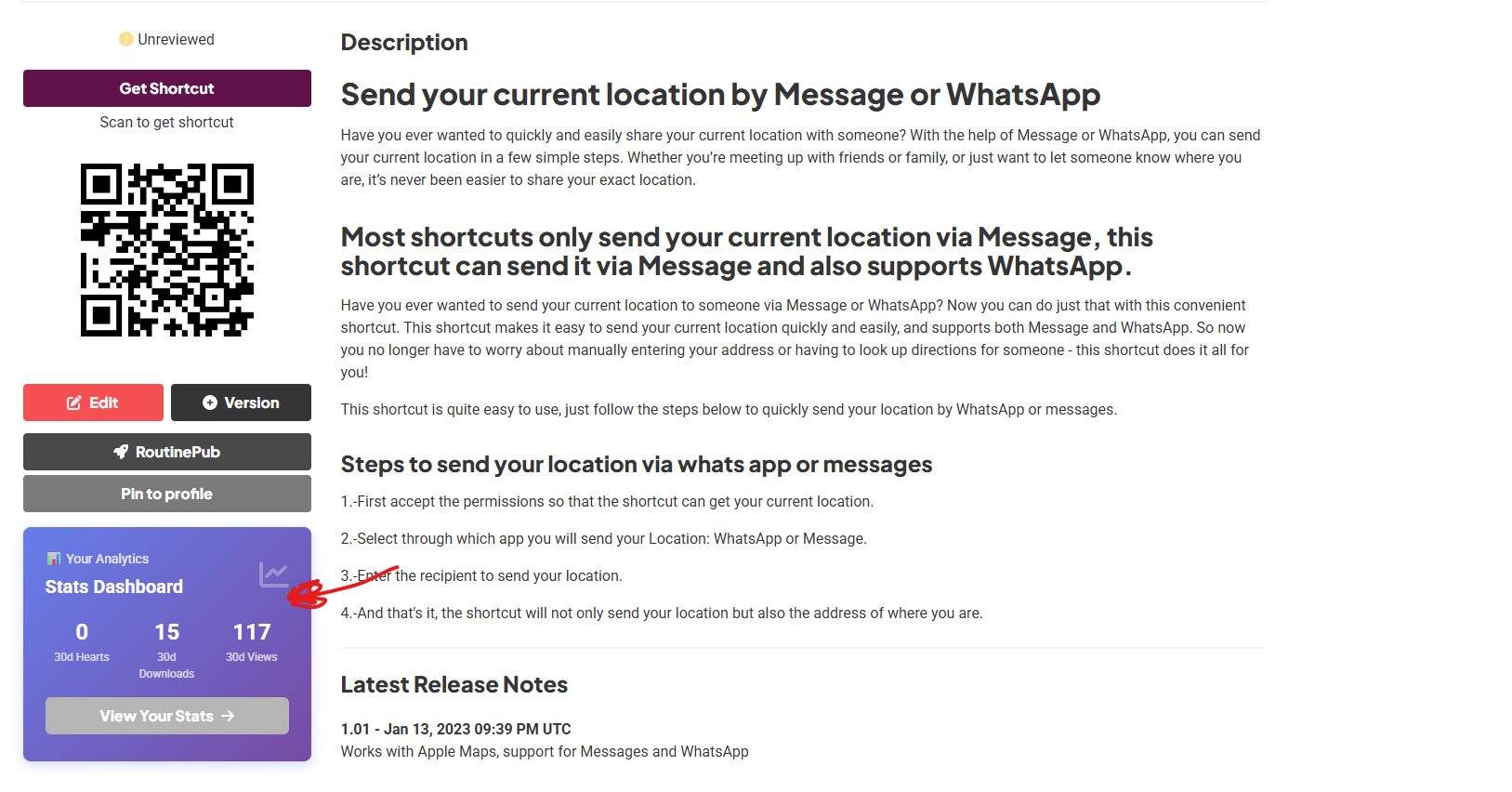
To access these insights, simply go to your "My Shortcuts" page on RoutineHub. Once there, when you click on any of your shortcuts to manage them, you will see a brand-new section prominently displayed called "Your Analytics".
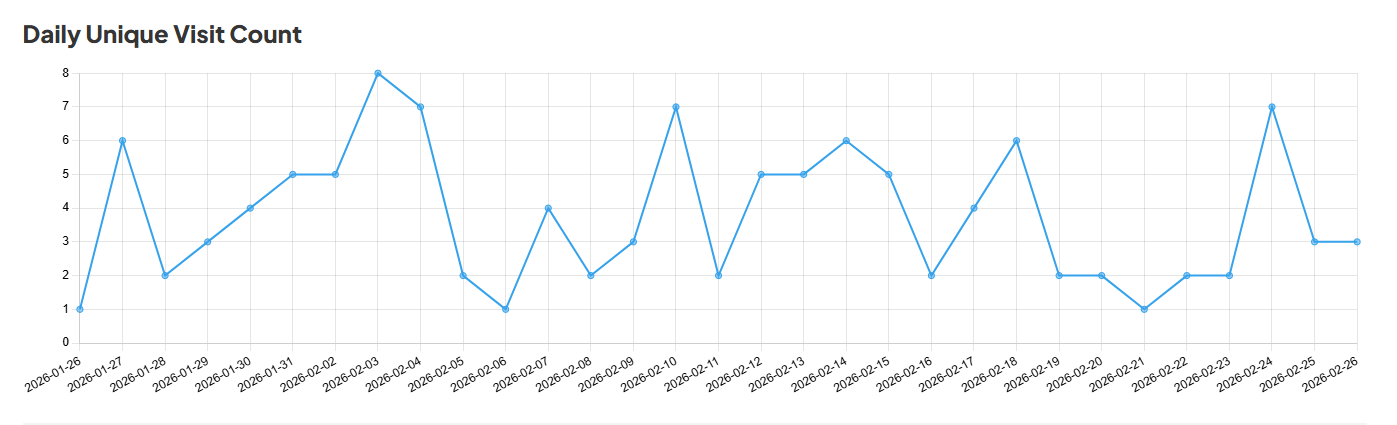
More Than Just Numbers: Data Intelligence
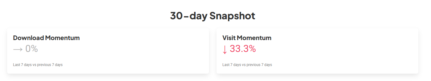
The new 30-day Snapshot doesn’t just tell you how many people visit; it tells you how effective your content really is.
1. "Momentum": Your Weekly Thermometer
RoutineHub now compares your last 7 days against the previous 7.
- Visit Momentum: Are you gaining traction or losing steam? A 33.3% drop in visits, as seen in this example, is a signal to update your shortcut or share it in new communities.
- Download Momentum: If your visits drop but your downloads remain at 0% (stable), it means your current audience is much more loyal and decisive.
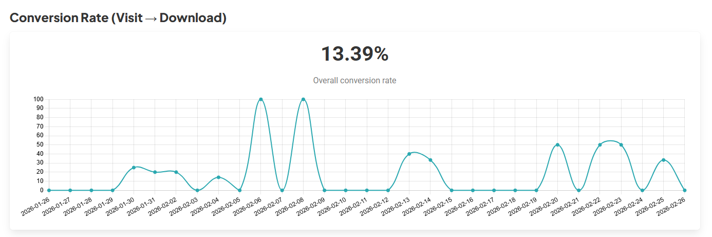
2. The Conversion Rate (Visit → Download)
One of the most valuable data points is the Conversion Rate. In our current analysis, we see a rate of 13.39%.
- What does it mean? For every 100 people who view your shortcut, more than 13 decide to install it. This is a massive indicator that your description, screenshots, and the shortcut’s utility are perfectly aligned with what the user is looking for.
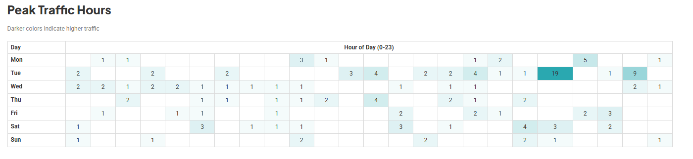
The Heatmap: When Should You Publish?
The Peak Traffic Hours chart is likely every data nerd's favorite feature. It uses a color scale (light to dark) to show you your periods of highest activity.
Tip: If you notice that Tuesdays at 11:00 AM and Saturday evenings are your peak hours, schedule your updates or launches just before those blocks to maximize initial impact.
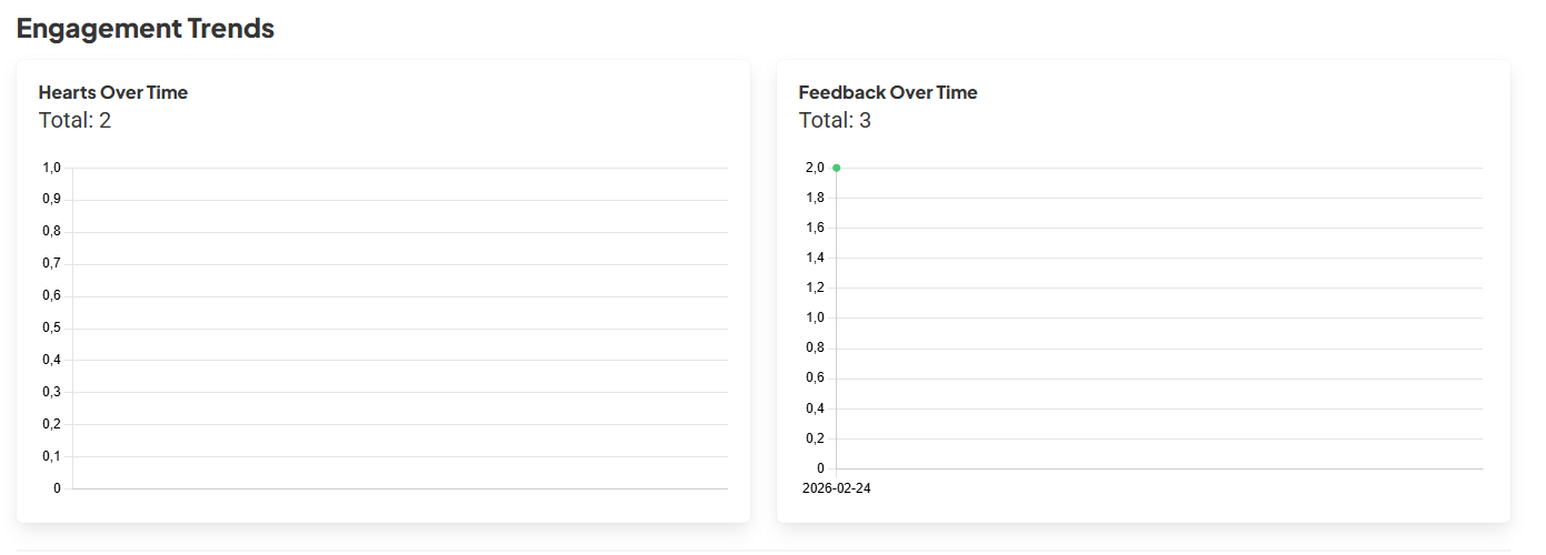
Feedback and Version Adoption
The dashboard also tracks Engagement Trends (Hearts and Comments) and which version of your shortcut people are actually using. This is vital for knowing if users are stuck on an old version with bugs or if they have successfully migrated to your latest big update.
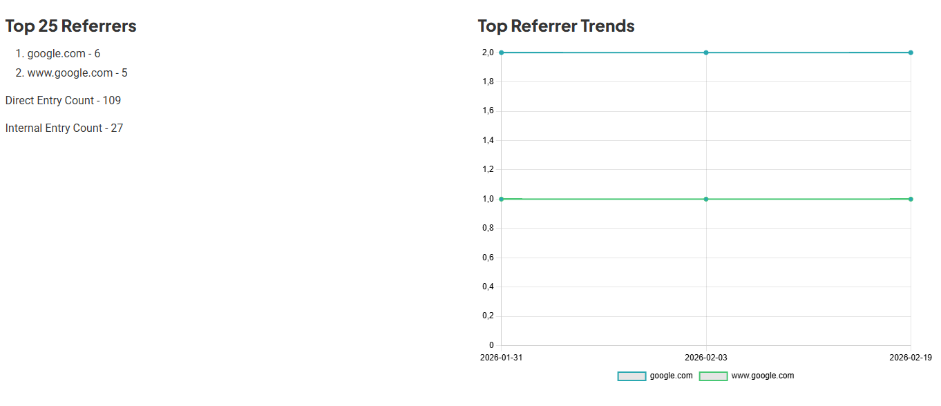
Where Are Your Users Coming From? (Referrers)
Did a blog share your link? Did they find you on Google? The Top 25 Referrers section is your treasure map:
- Direct Entry: Most users are coming straight to your link. Your social media marketing is working!
- Google Search: Your shortcut is starting to index. Optimizing keywords in your description will help boost this number.
Availability
These powerful analysis tools are the latest addition to the RoutineHub ecosystem.
It is important to note that these advanced statistical features and the detailed dashboard are available exclusively for Subscription Developers. If you want to take your shortcuts to the next level and understand your audience’s behavior like a professional, now is the time to make the jump.
To be honest, we would love for this to be a feature available to everyone. However, keeping RoutineHub running involves significant costs; from data storage to ongoing maintenance, the overhead can sometimes be overwhelming. By subscribing, you aren’t just supporting the future of this project—you are also unlocking premium features, exclusive advanced stats, and a completely ad-free experience